HEINEKEN AT THE UCL FINAL 2024
THE BRIEF:
Bring the brand to life in a playfully varied, London-centric and football focussed way, for a weekend of events leading up to the UEFA Champions League Final.
THE SOLUTION:
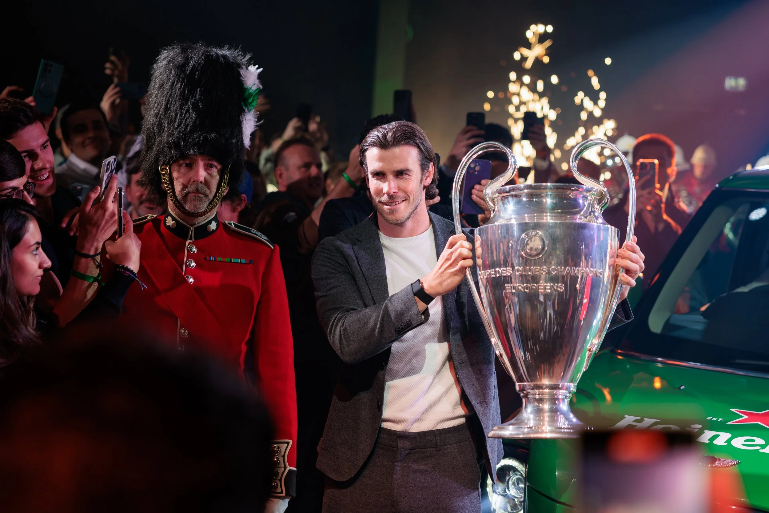
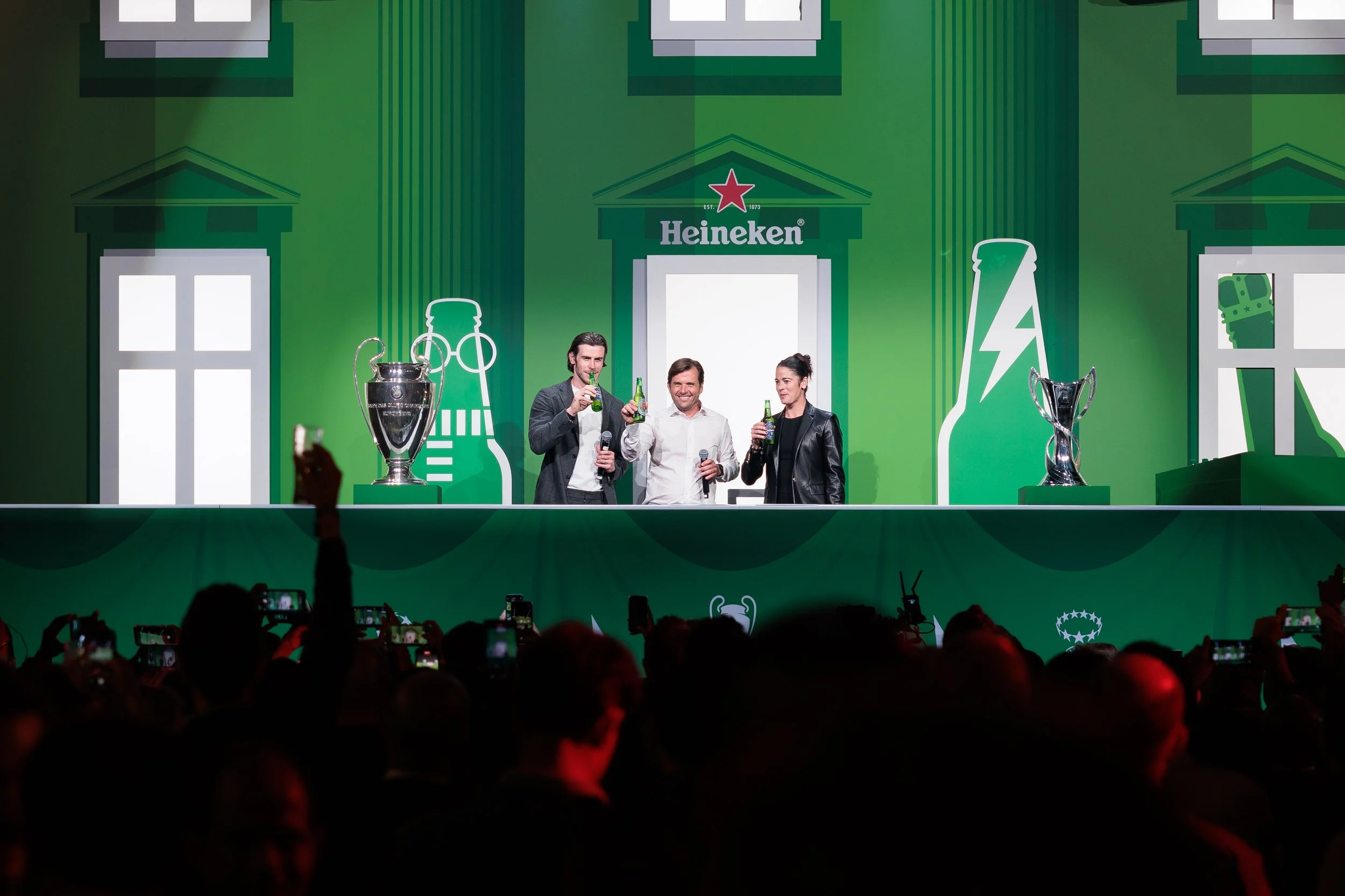
I defined and developed a unique graphic language for 3 large scale events spanning an opening party overlooking Canary Wharf, drinks beneath the London eye and a takeover of Wembley’s Lioness Lounge for key Heineken stakeholders.
With newly released guidelines from Heineken, this was a great opportunity to push the brand creatively, bringing the events to life with playful London references, footy terminology… and several thousand puns (of varying quality).
MY ROLE:
Lead graphic designer & supporting creative:
Developing a unique graphic look and feel, and rolling it out across 3 locations.
AGENCY:
Jack Morton
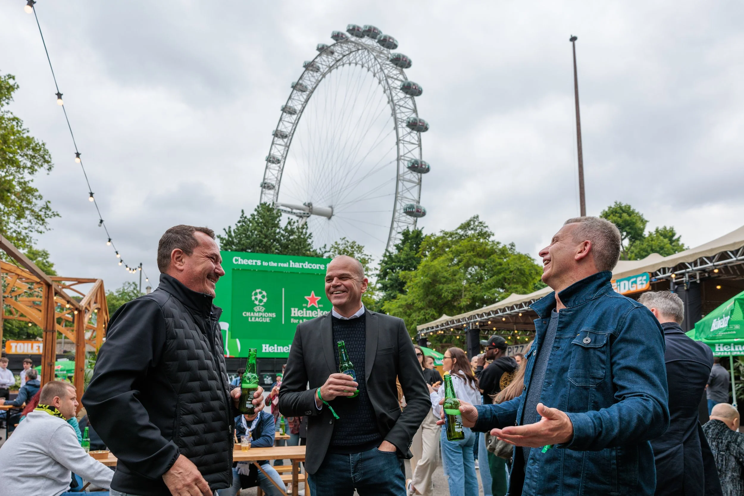
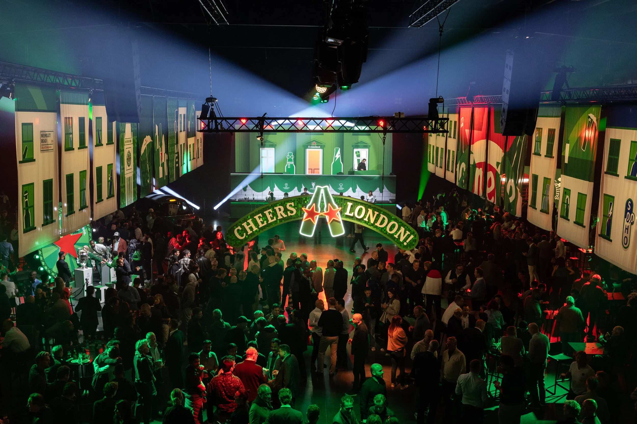
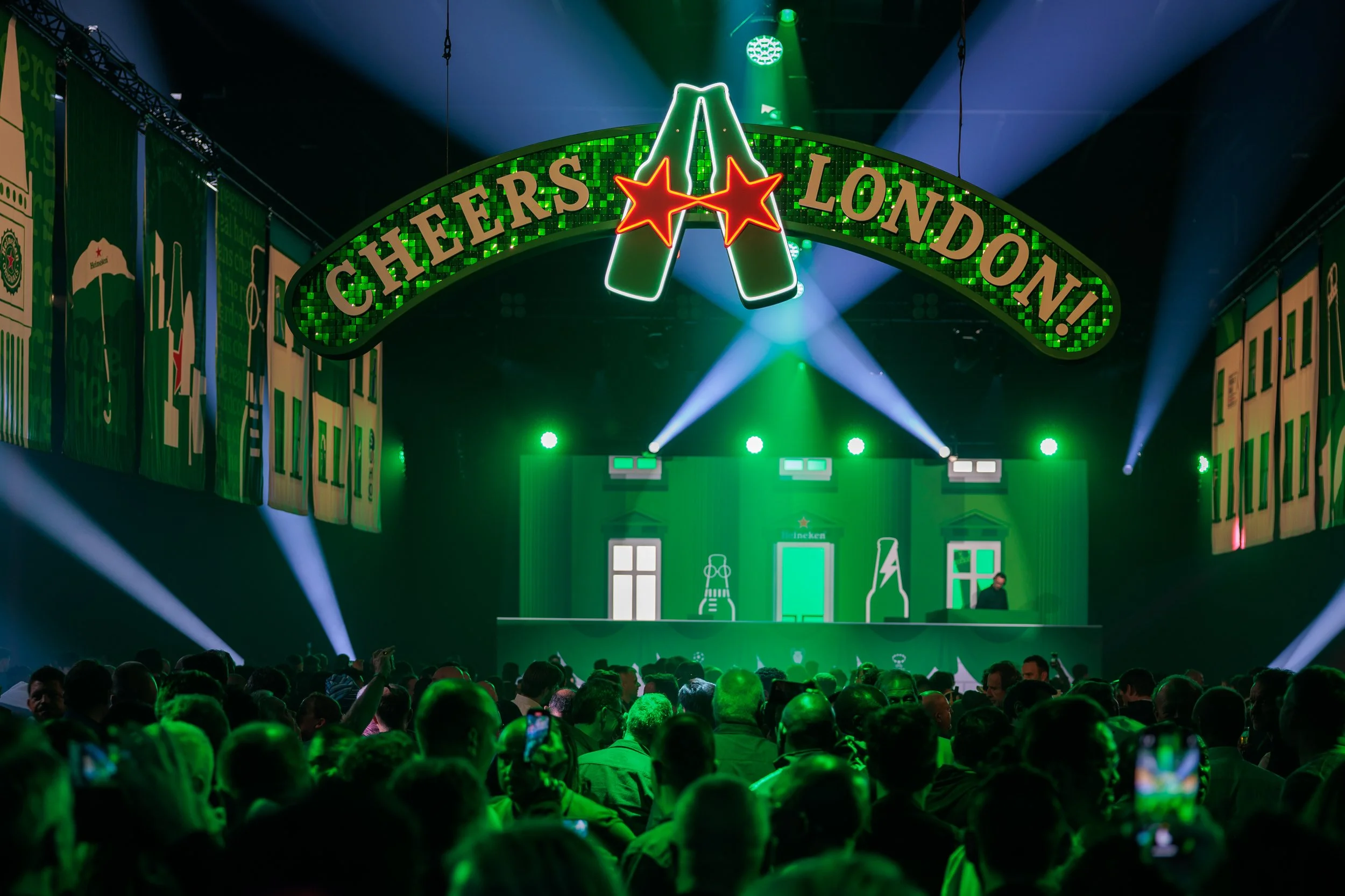
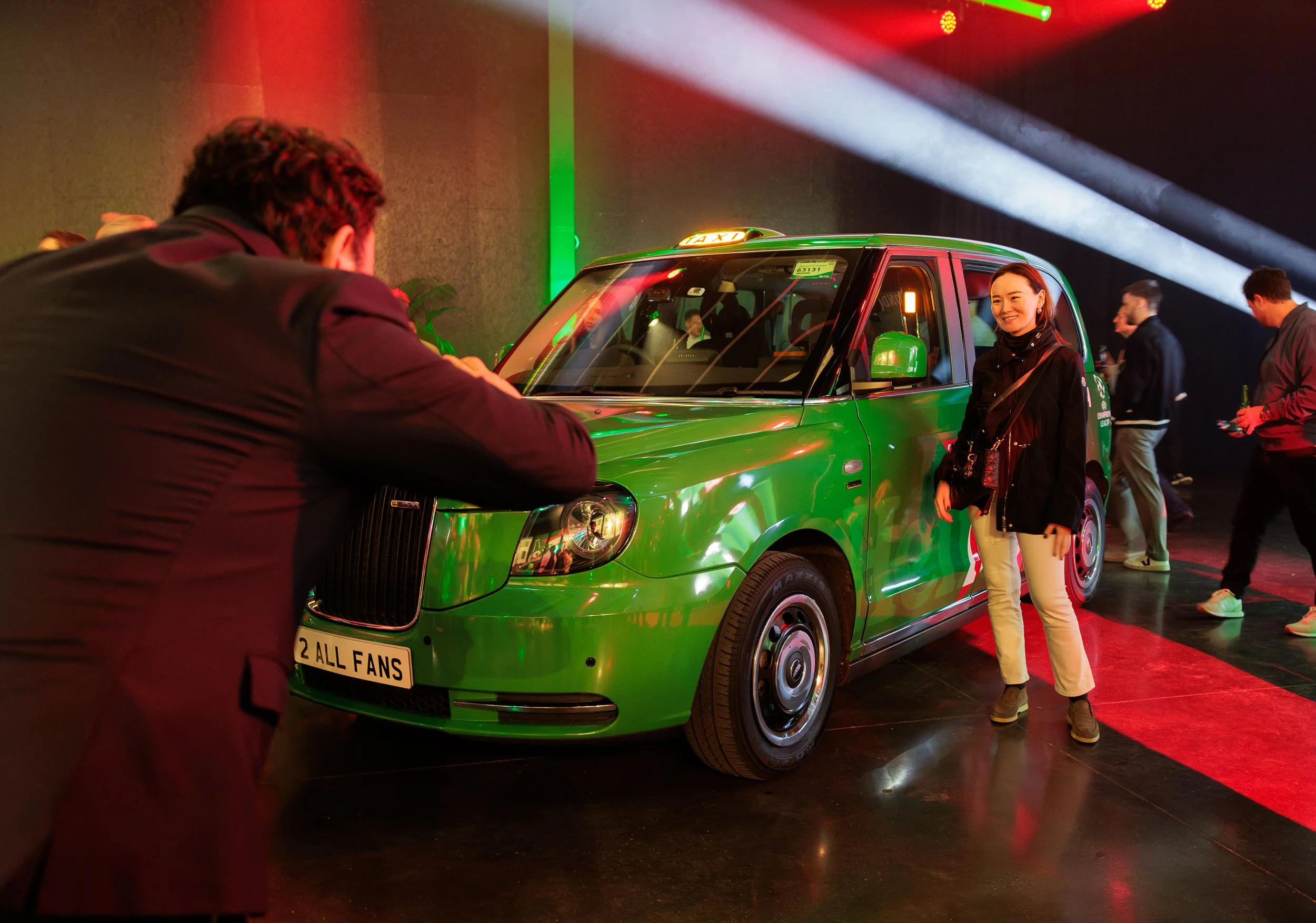
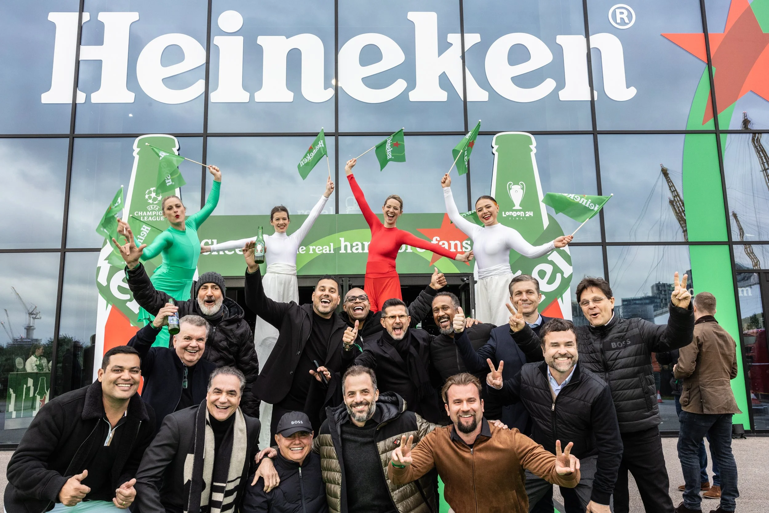
Day 1:
Friday night @ Magazine London
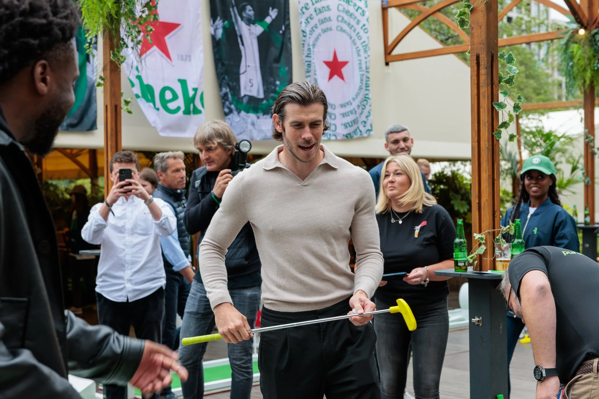
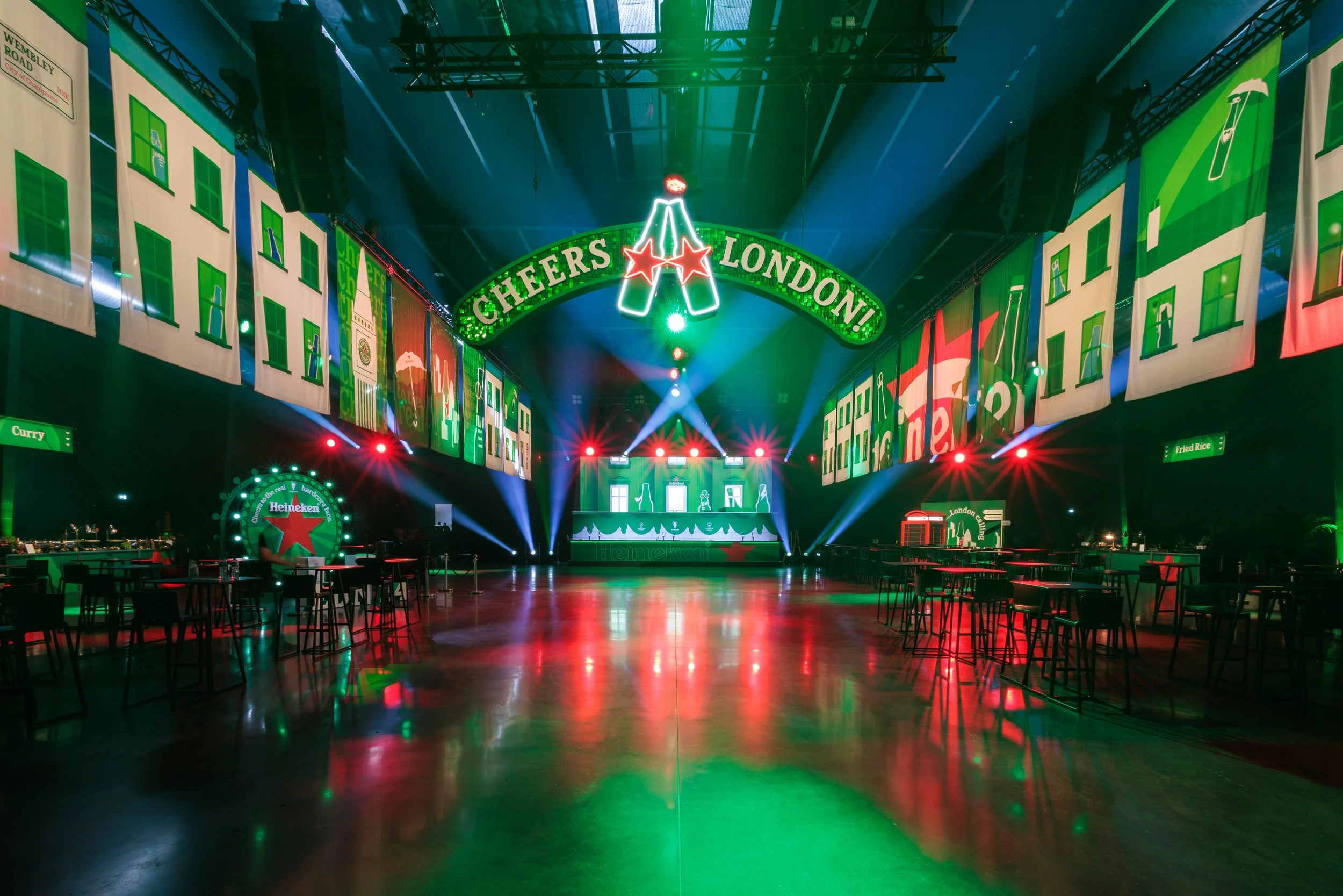
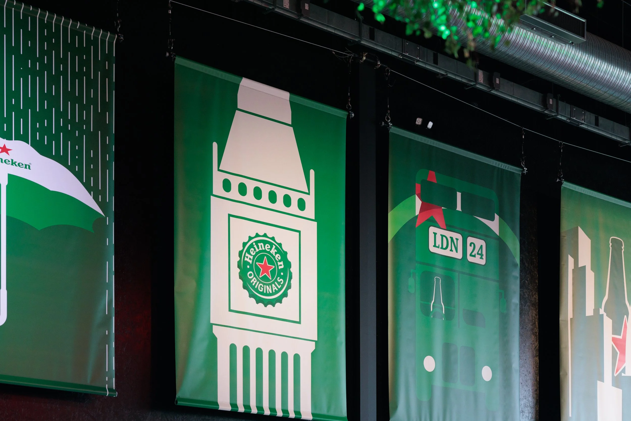
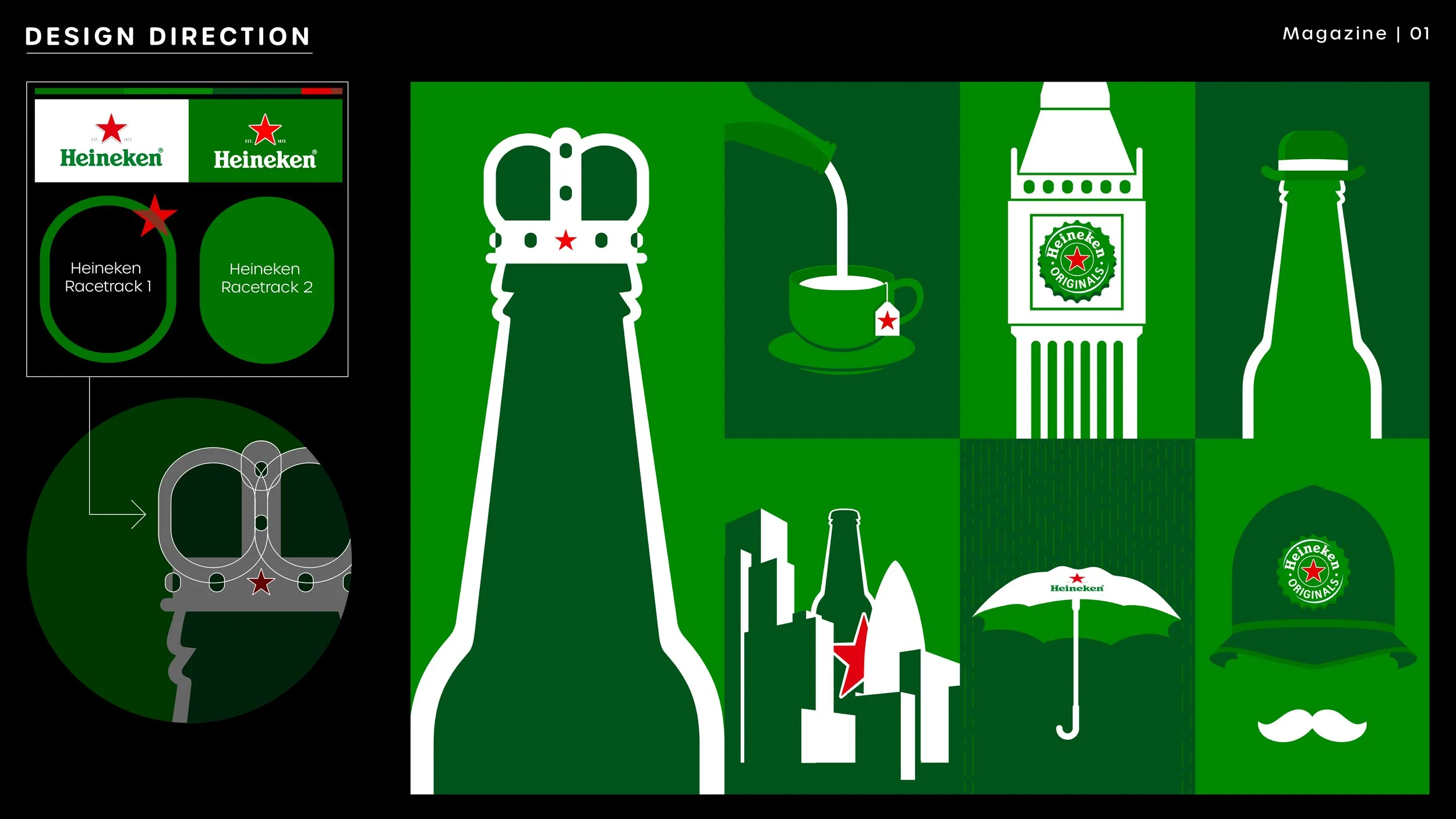
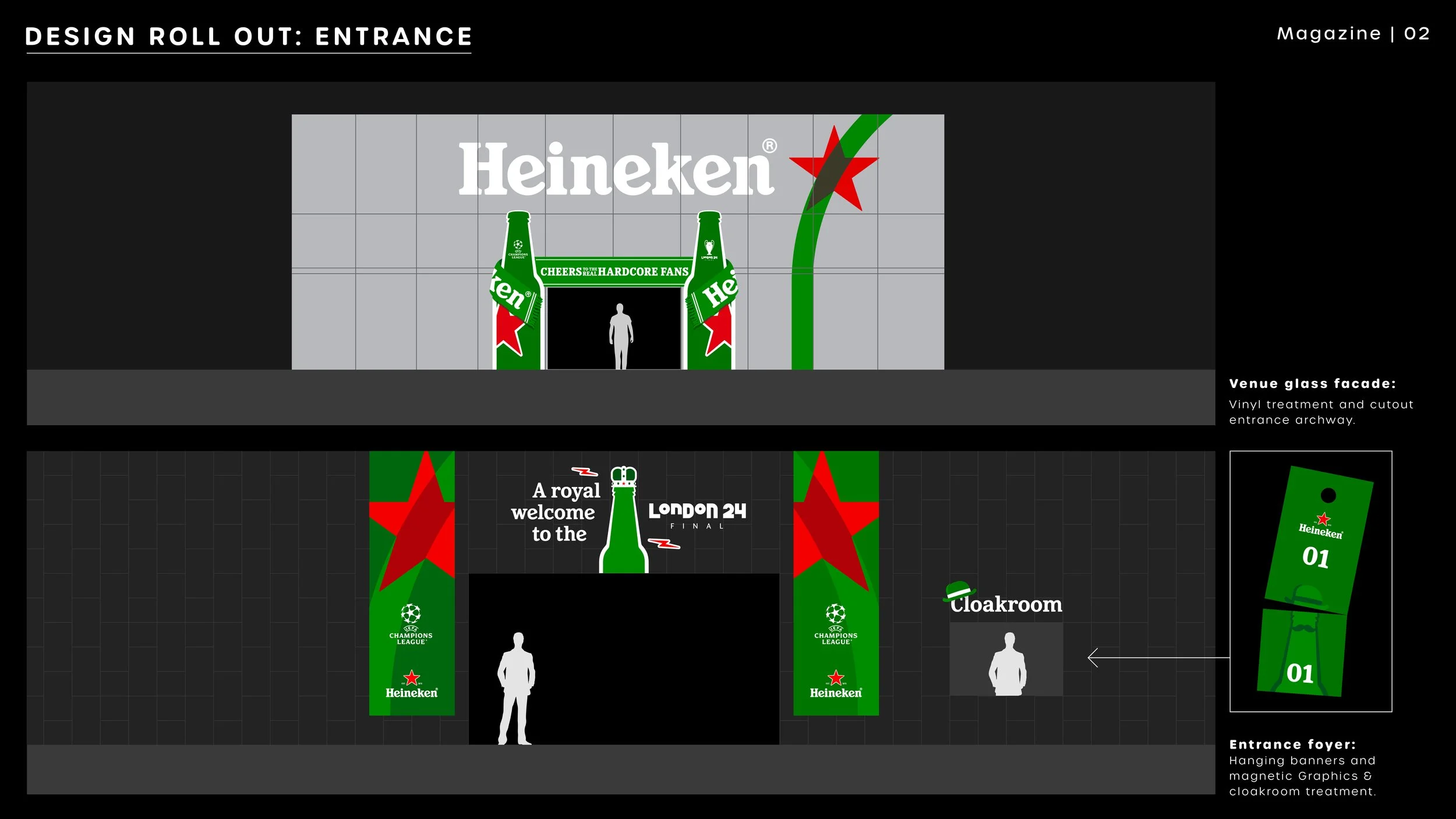
For the first night of the event, I worked off a loose design brief to create a graphic language which combined the new Heineken brand with London-centric imagery, originally in a style that fit with a theme of an art gallery. As the creative progressed, this theme fell by the wayside in favour of a broader approach to appeal better to the international audience attending.
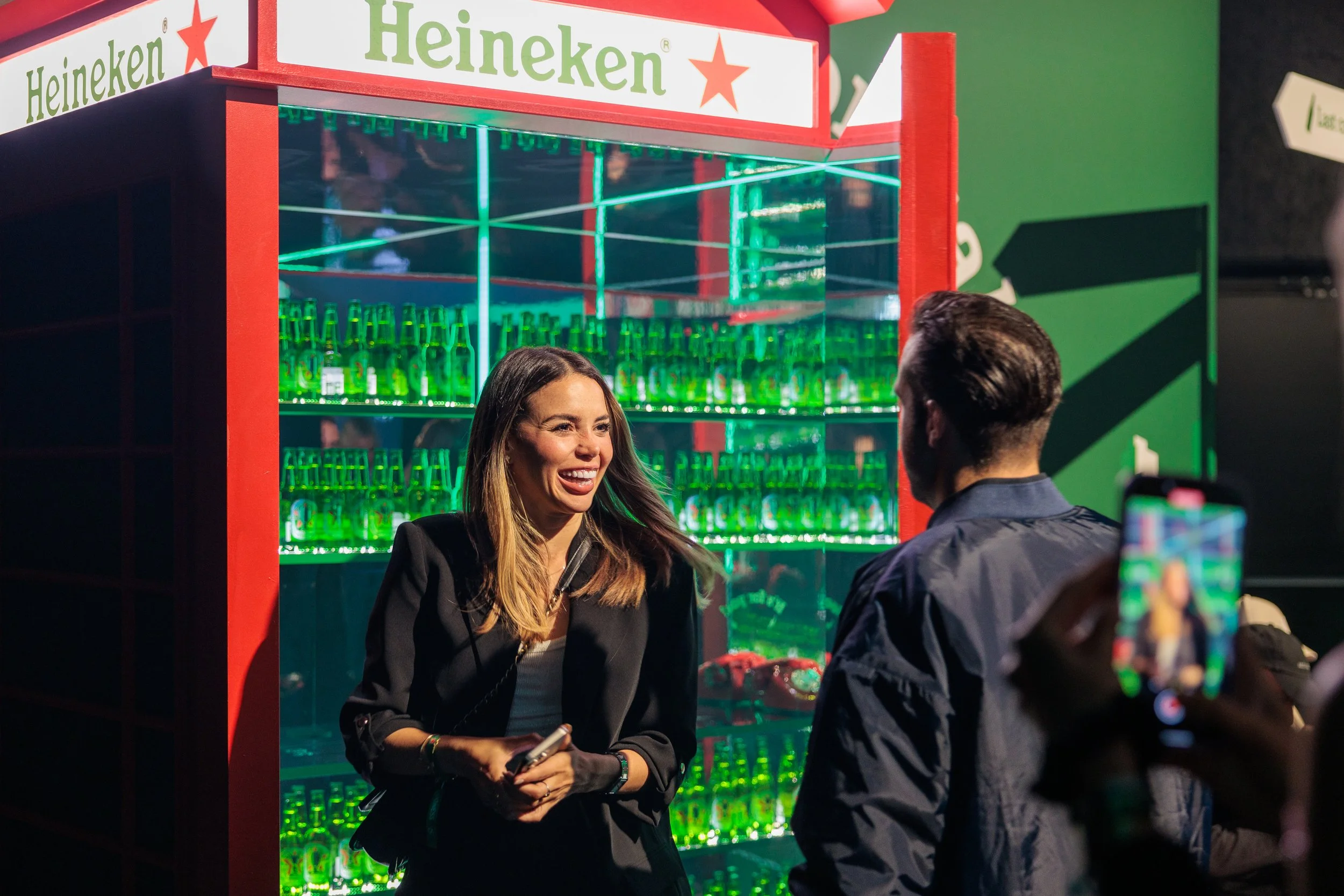
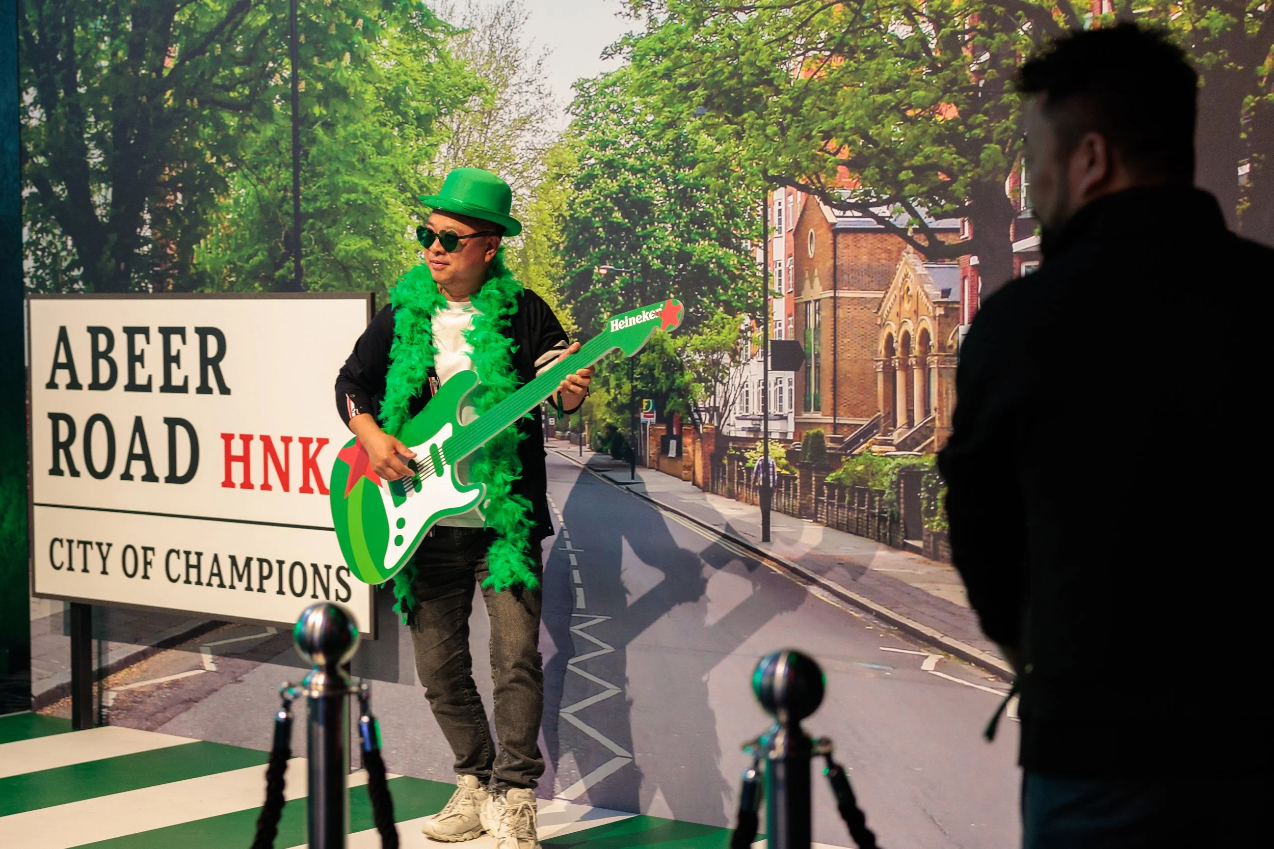
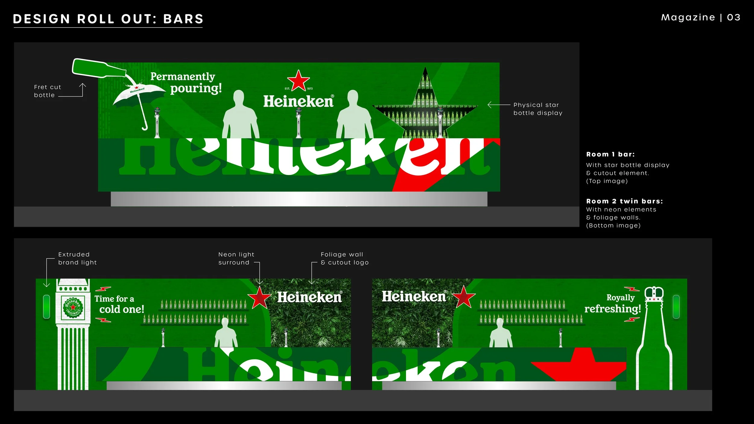
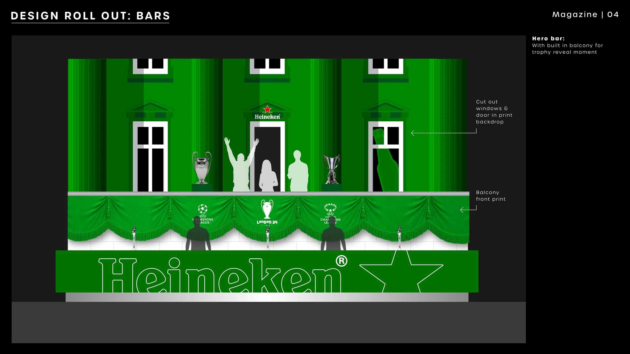
I sold in the design route with a series of tongue-in-cheek vector posters, each playing off English cultural hallmarks and constructed from the limited Heineken brand elements available, like their star and racetrack combination. With this style signed off, I was then able to roll it out across print elements around the space, from hanging banners and photo-ops to a Buckingham Palace styled balcony bar.
Day 2:
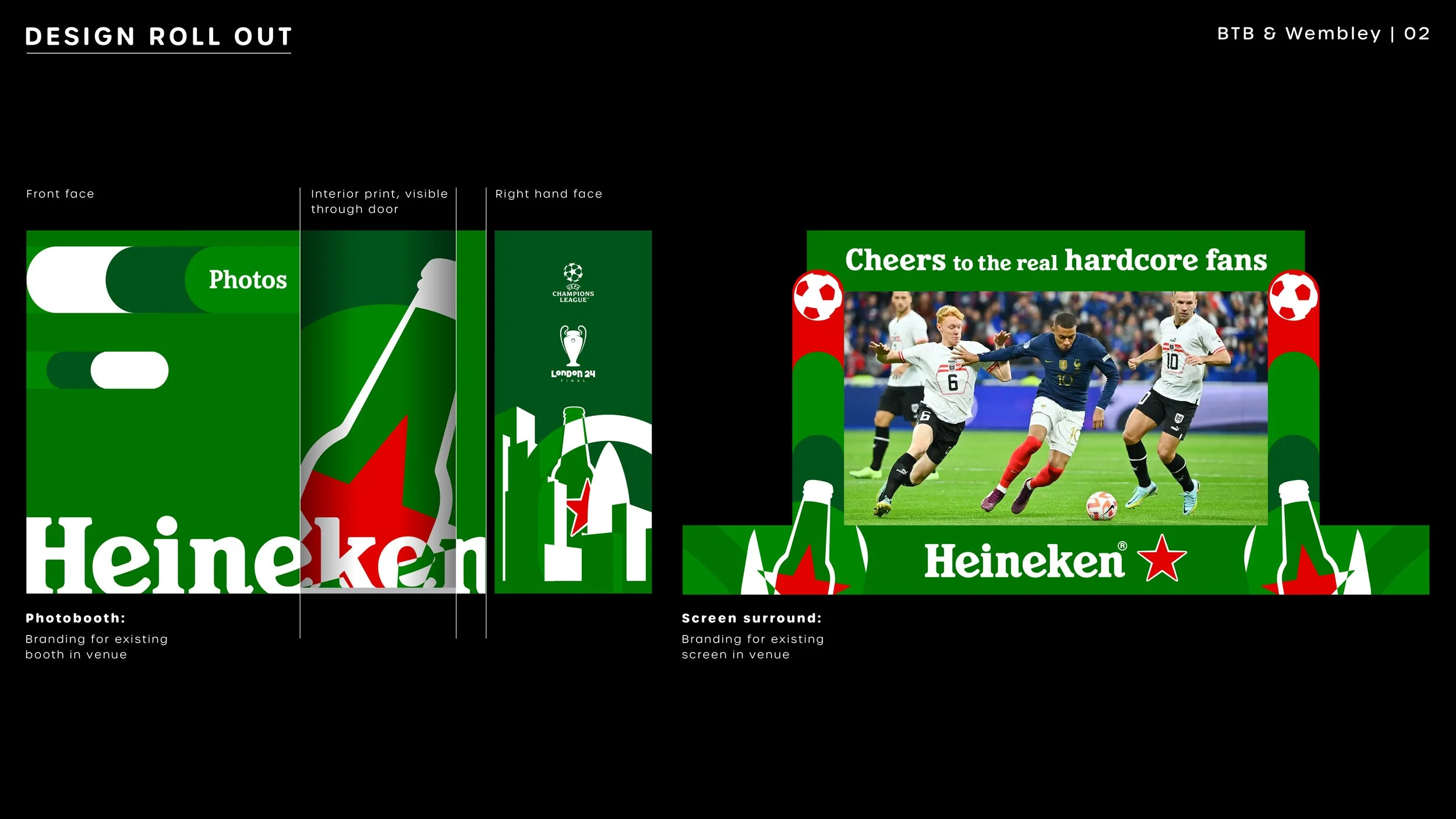
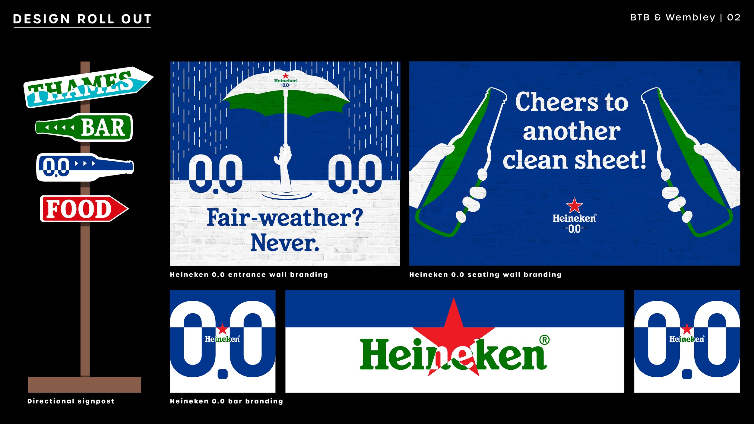
Saturday @ Between the Bridges & Wembley Stadium
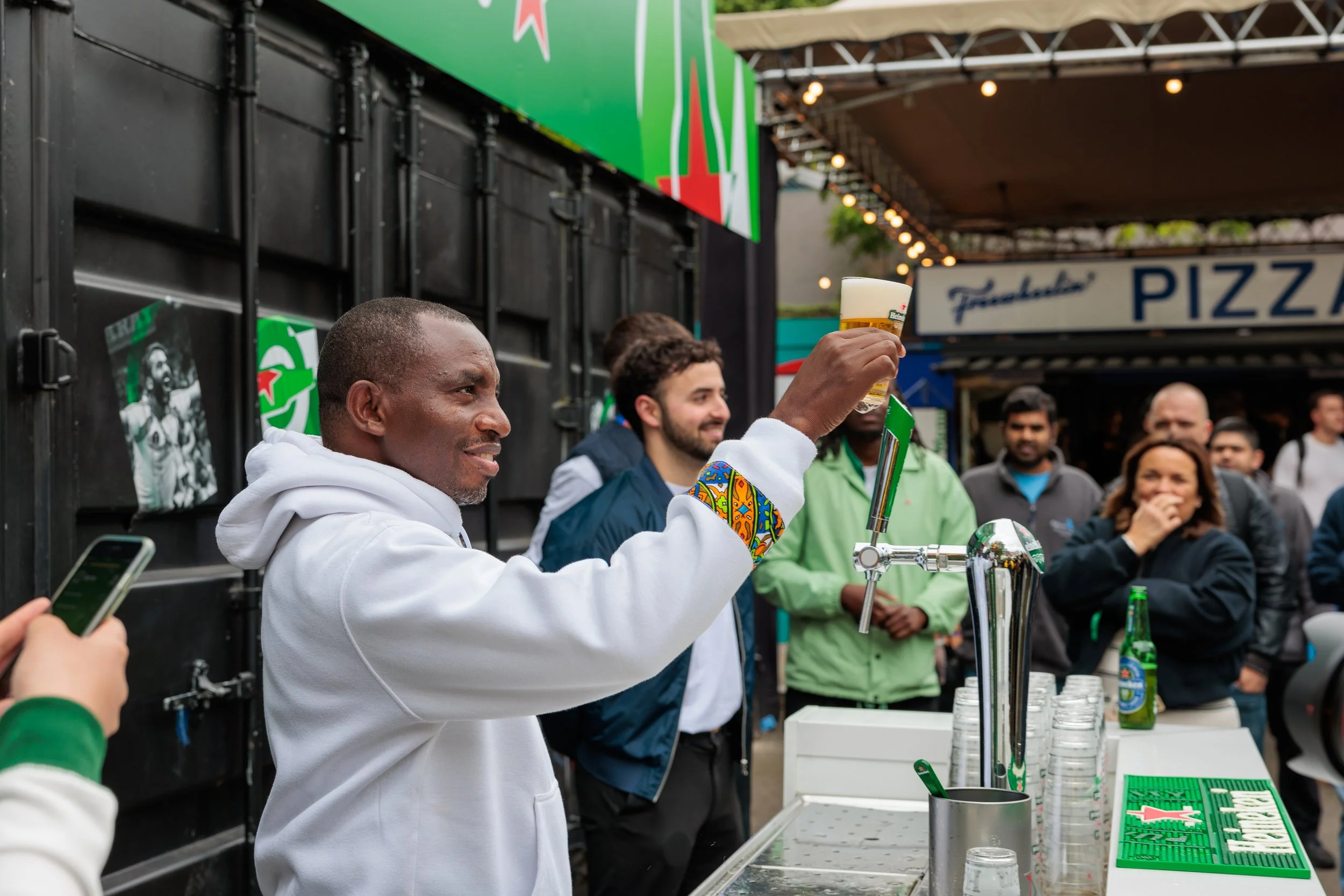
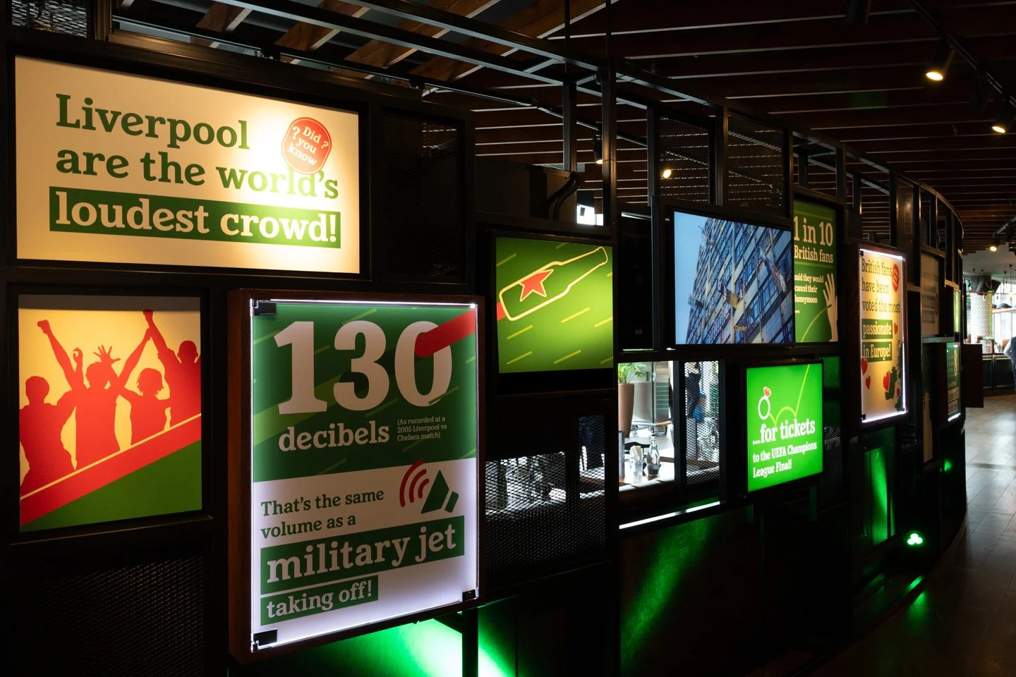
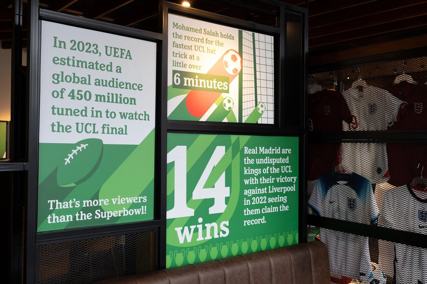
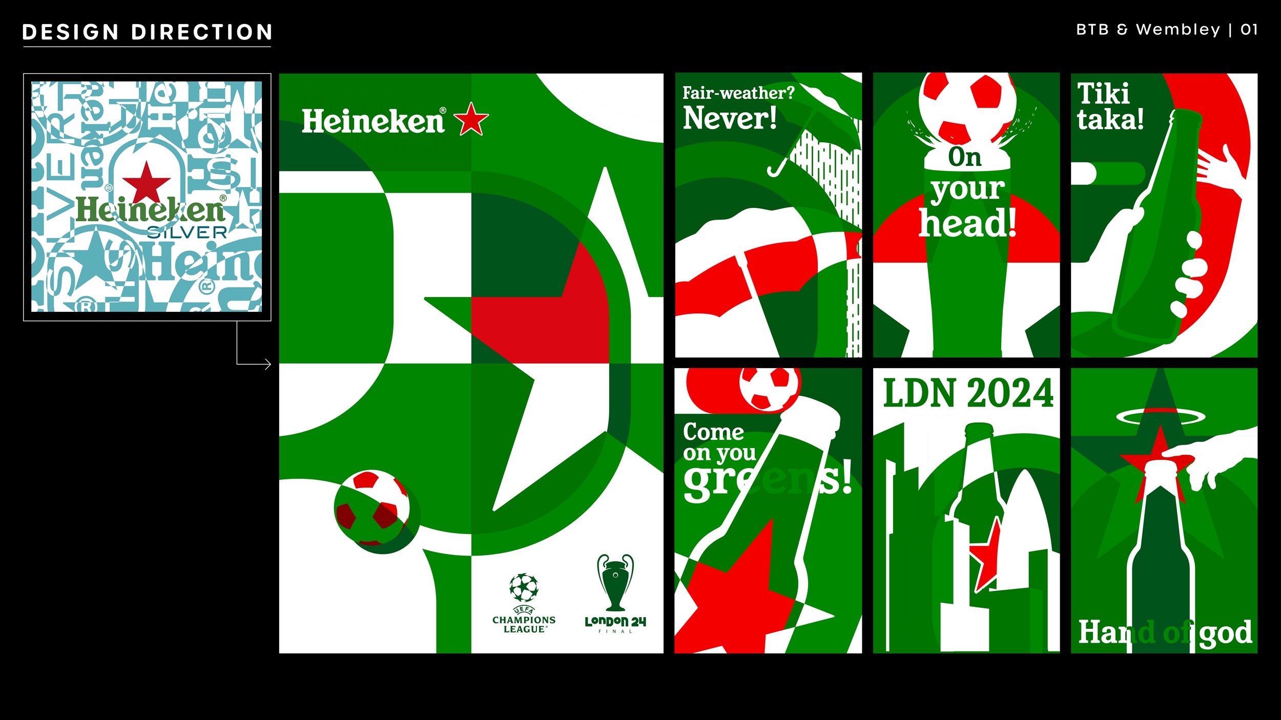
For the second day of events I was tasked with taking the graphic language from Magazine, and rolling it out across two new locations: Between the Bridges (for casual afternoon drinks) and Wembley Lioness Lounge (an exclusive bar for guests to use during the final).
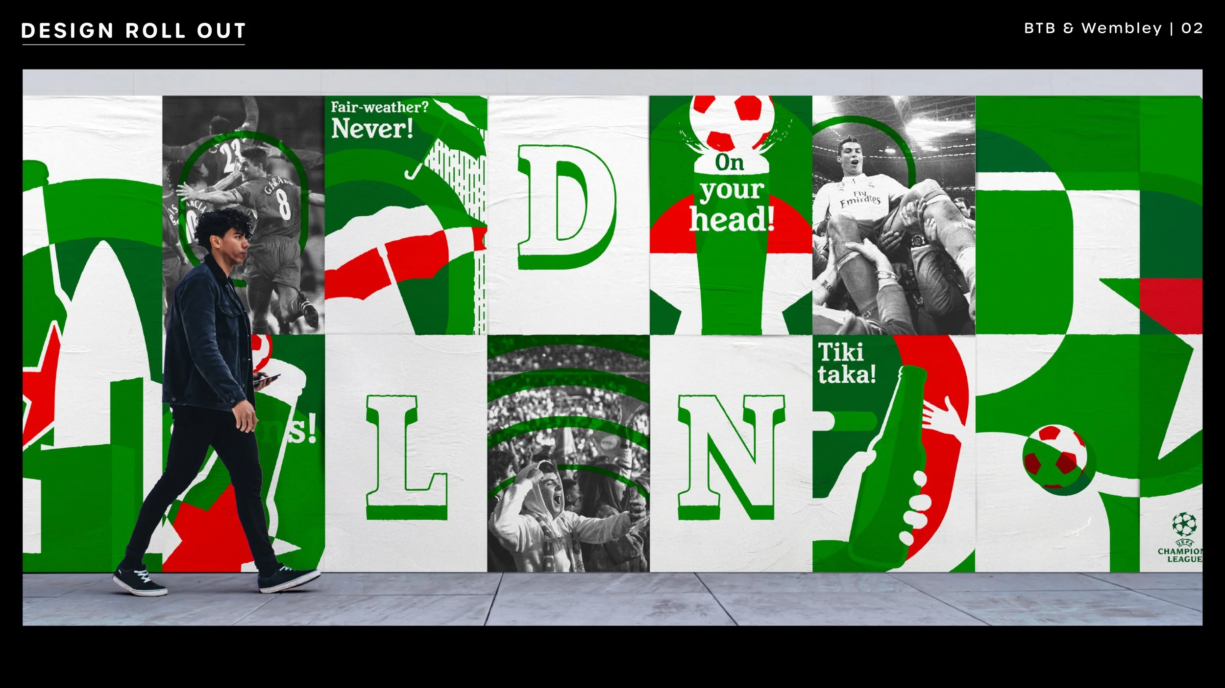
Initial theming for Between the Bridges, worked up by the creative director was a Heineken styled street party. With this in mind, I built on the direction of the Magazine graphics to create a series of textured fly posters playing off the eclectic overlaid style of the new Heineken Silver branding. While the design intent was originally to have these applied large scale to the walls around the venue, the budget was put towards Magazine instead, so all branding was scaled down.
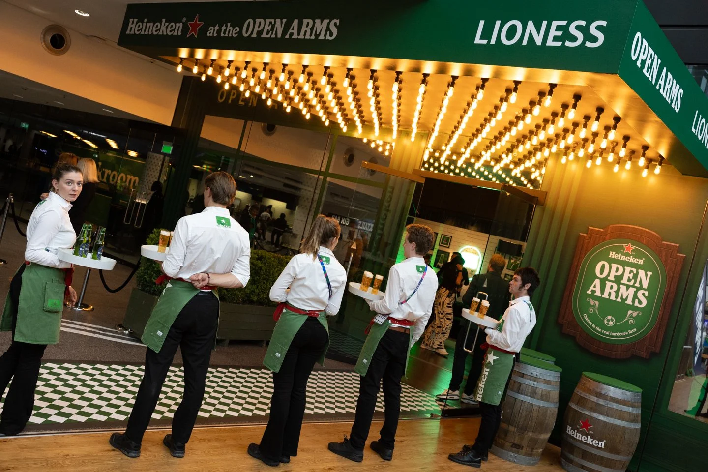
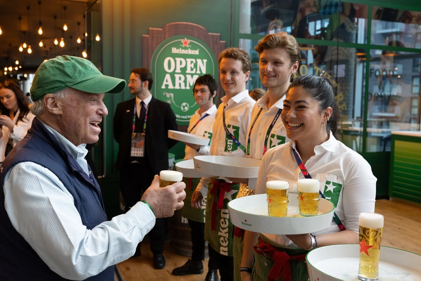
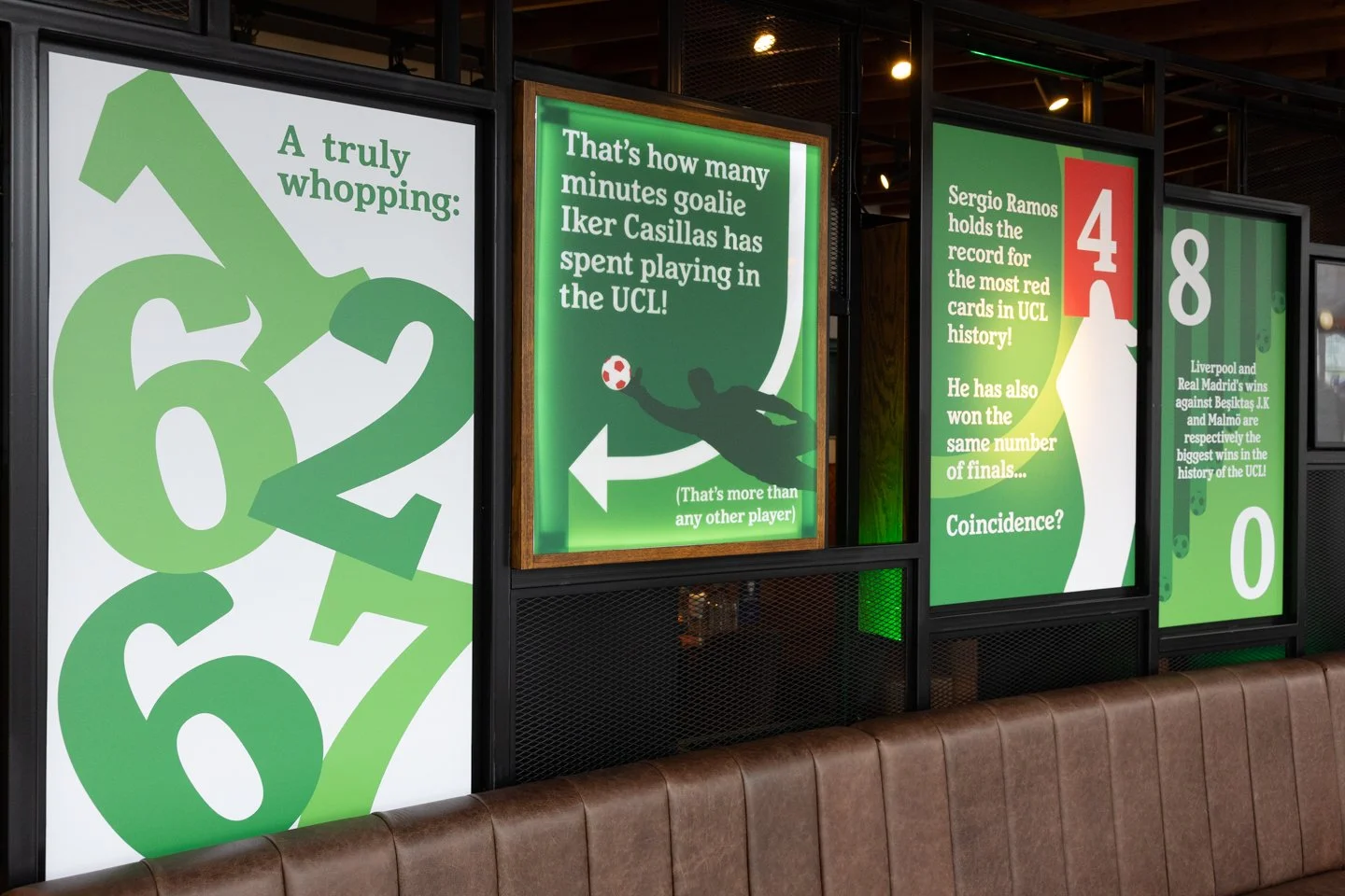
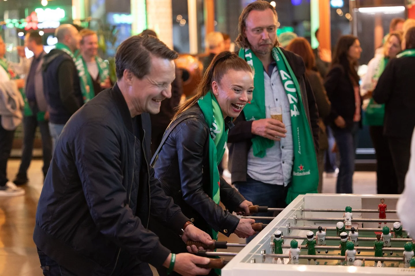
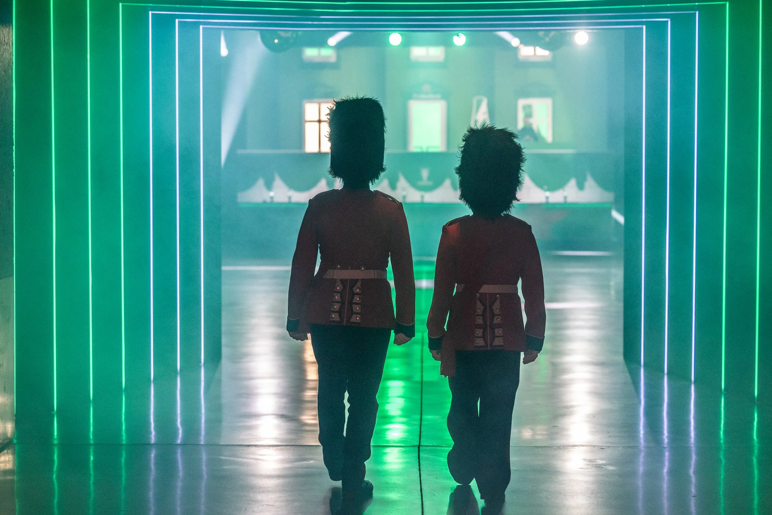
For Wembley Lioness lounge, the task was to create graphics in a similar style that fit the existing bars and frames in the space, with a focus on fun, factual content that could be enjoyed by any guests attending the match solo. In addition to this, we styled the entranceway glass with a British pub vinyl, rebranding the iconic bar as the ‘Open Arms’ for one night only.